Handle Different Screen Sizes with TestSweets Automated Flutter Tests
When it comes to testing on different devices, the size of the screen will vary. This means that the placement of certain interactions might not be at the correct place.
How does this work?
When you place an interaction point on screen we save the screenWidth and the screenHeight with it.
When you open the app on a different device we’ll use the original screenWidth and screenHeight and scale the position of the interaction accordingly.
This is not the most accurate solution, so we’ve added a second layer of screenBuckets , here’s how it works.
Per Screen Size Adjustments
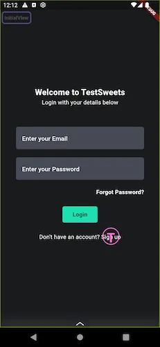
Let’s say you place an interaction point on Device A (392x802) as you see below. We put a touchable interaction on the signUpLink which is usually just tec
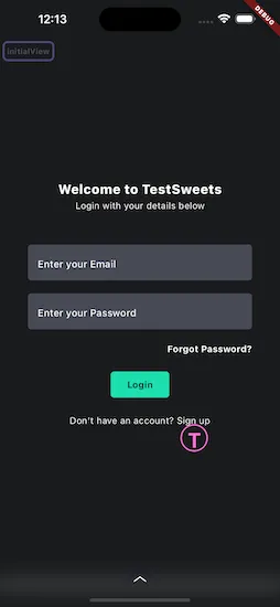
When you open the app on a larger phone (Device B), like the iPhone 15 Pro Max (430x932), you’ll see that our responsive sizing is not always the most accurate, especially when there are big differences in the screen resolution.
To correct the position of the interaction point on the new device you can:
- Long press on the interaction
- Move it to the location that you want
What TestSweets will do is create a new device screen bucket and store the new location against that.
This means that when you open the app on the original device it will still be at the exact same position, and on the new device it will also be at the same position.
Closest Screen Size Match
The benefit of having multiple device sizes in its correct position is that it makes our responsive solution more accurate.
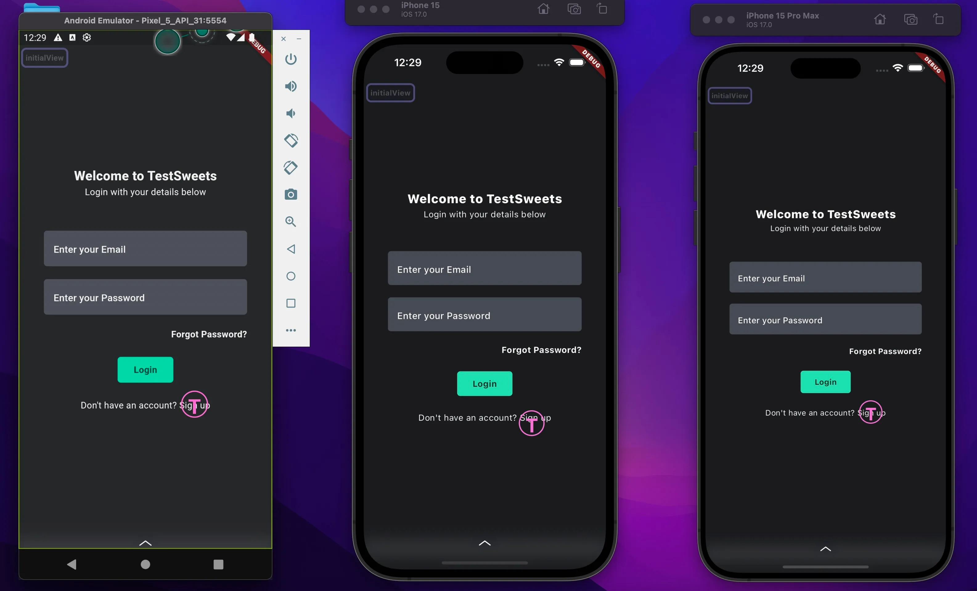
If we now open the app on a device that’s in the middle of Device A and Device B we will find the closest screenSize to the current screen size and use that for our responsive scaling.
You’ll see in the image below, that even though it’s not in the exact centre of the widget, it overlaps enough to ensure that we can still interact with the widget.
This means that we can capture and adjust on the extremes, and the middle devices will all responsively scale to the correct position.
With this functionality you can adjust positions on different orientations and screen sizes without affecting the original positions of the interaction points.